前言
之前很好奇Element UI中的消息提示message是如何实现支持连续点击生成多个消息提示并且能够自动回收(消息收起隐藏)的,这两天需要用到类似的功能,我就去研究了一下element ui关于这一功能的源码,然后发现了一些很好玩的东西。:)
源码分析
- Element UI的message相关代码

- Element UI的message组件生成的DOM节点

于是我猜想,大致流程应该是这样的:
-
通过js动态创建元素节点
-
赋予元素相应的样式属性及方法
- 下沉动画及基础样式
- 堆叠层级(z-index)
-
绑定元素与回调函数
- 淡出或隐藏效果处理函数(
将处理方法与实时的元素绑定,这也就是为什么每个消息提示能够单独自动回收)
- 淡出或隐藏效果处理函数(
-
追加元素节点到文档
然后我就模拟着写了一些代码:
- javascript
function showTips(msg, isSuccess = 1, isAutoClose = true) {
        var ele = document.createElement("div"),
          zIndex = 30 + document.getElementsByClassName("global-msg-tips").length + 1;
        ele.textContent = msg;
        ele.style.display = "block";
        ele.style.zIndex = zIndex;
        ele.className = "global-msg-tips " + (isSuccess == 0 ? "success" : "error");
        ele.fadeOut = function() {
          setTimeout(function() {
            ele.remove();
          }, 3000)
        }
       document.body.appendChild(ele);
}
- html & css
<!DOCTYPE html>
<html>

  <head>
    <meta charset="utf-8">
    <meta name="viewport" content="width=device-width,initial-scale=1,minimum-scale=1,maximum-scale=1,user-scalable=no" />
    <meta name="renderer" content="webkit" />
    <style type="text/css">
      html,
      body {
        user-select: none;
        -webkit-user-select: none;
        -moz-user-select: none;
        background-color: #000;
        width: 100%;
        min-height: 200px;
        color: #fff;
        margin: 0;
        padding: 0;
      }

      .global-msg-tips {
        position: fixed;
        z-index: 30;
        width: 100%;
        height: 44px;
        text-align: center;
        color: #fff;
        line-height: 44px;
        font-size: 14px;
        top: -44px;
        border: none;
        animation: tips_animate 3s ease-in-out;
      }

      @keyframes tips_animate {
        0% {
          transform: translateY(0px);
        }
        50% {
          transform: translateY(176px);
        }
        100% {
          transform: translateY(176px);
        }
      }

      .error {
        background-color: #e91e63;
      }

      .success {
        background-color: #009688;
      }

      .btn {
        width: 60%;
        text-align: center;
        border: none;
        cursor: pointer;
        color: #fff;
        height: 50px;
        border-radius: 2px;
        margin-bottom: 2px;
      }

    </style>

  </head>

  <body>
    <div style="position:fixed;bottom:0;width:100%;text-align:center;">
      <button type="button" class="btn success" onclick="showTips('Success message', 0)">click here!</button>
      <button type="button" class="btn error" onclick="showTips('Error message',1)">click here!</button>
    </div>
</body>
</html>
效果
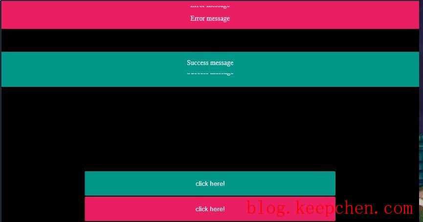
大致实现了Element UI消息提示组件的加载原理,真好玩。:)
---------------------------------------------分割线---------------------------------------------------
2019年3月30日更新: 可能有细心的小伙伴发现了,消息提示的层级显示有bug,原因是计算层级的方式不妥当,因此,这里加以修正:
function showTips(msg, isSuccess = 1, isAutoClose = true) {
        var ele = document.createElement("div"),
              //zIndex = 30 + document.getElementsByClassName("global-msg-tips").length + 1;
              messageEle = document.getElementsByClassName("global-msg-tips");
        //获取最后一个消息提示的显示层级,新的消息提示层级在此基础上+1
        var zIndex = messageEle.length == 0 ? 30 + 1 : parseInt(messageEle[messageEle.length-1].style.zIndex) + 1;
        ele.textContent = msg;
        ele.style.display = "block";
        ele.style.zIndex = zIndex;
        ele.className = "global-msg-tips " + (isSuccess == 0 ? "success" : "error");
        ele.fadeOut = function() {
          setTimeout(function() {
            ele.remove();
          }, 3000)
        }
       document.body.appendChild(ele);
}
")
觉得博主写的不错?给他一个赞赏: